Using data about antidepressant efficacy to illustrate Cohen's d, demonstrate why you need a control group, talk about interactions.
This example is from The Economist and behind a paywall. However, it is worth using one of your free monthly views to see these visualizations of how much improvement Ps experience. That said, whenever I talk about antidepressants in class, I remind my students MANY TIMES that I'm not that kind of psychologist, and even if I was, I'm not their psychologist. Instead, they should direct any and all medication questions to their own psychologist.
This blog post was inspired by "Antidepressants are over-prescribed, but genuinely help some patients" from The Economist, which was in turn inspired by "Response to acute monotherapy for major depressive disorder in randomized, placebo-controlled trials submitted to the US FDA: individual participant data analysis", by M.B. Stone et al., BMJ, 2022; "Selective publication of antidepressant trials and its influence on apparent efficacy: updated comparisons and meta-analyses of newer versus older trials", by E.H. Turner et
al., PLOS Medicine, 2022
Psst...here is a PDF of the original article. Unfortunately, the article itself is behind a paywall, but The Economist does give a limited number of freebie articles per month.
1. Let's discuss effect sizes. Every visual representation of Cohen's d looks like these visualizations used to describe the distribution of experimental vs. control in three different groups of patients.
This research's outcome measure was the Hamilton depression score, divided into three groups.
2. Discuss the three groups created by the Hamilton depression inventory. Was it reasonable to dichotomize (trichotomize) a continuous variable?
3. Let's discuss the six-cell design and interaction ^
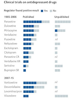
4. Discuss this straightforward way to break down and think about multiple studies. Keep you forest plots, psychologists, and give me more of these, The Economists!


Comments
Post a Comment