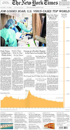
Unlike the Chartr newsletter, I love this as it feeds my fascination with data and provides interesting examples for the class. As I sit here writing (5/11/24), I am enjoying my other favorite stats newsletter, How to Read This Chart. The current newsletter discusses data visualizations used on the front page of the Post. Such as:
Philip Bump lovingly curates this newsletter. One time, he found historic, unlabeled charts and asked readers for help interpreting them. I also thought this one, which compared the margin of error and sample sizes used by major national polling firms, fascinating.


Comments
Post a Comment