
Barry-Jester's "What A Bar Graph Can Tell Us About The Legionnaires’ Outbreak In New York" + CDC learning module
Statistics aficionados over at FiveThirtyEight applied statistics (specifically, tools used by epidemiologists) to the Summer of 2015 outbreak of Legionnaires' Disease in New York. This story can be specifically used in class as a way of discussing how simple bar graphs can be modified as to display important information about the spread of disease.
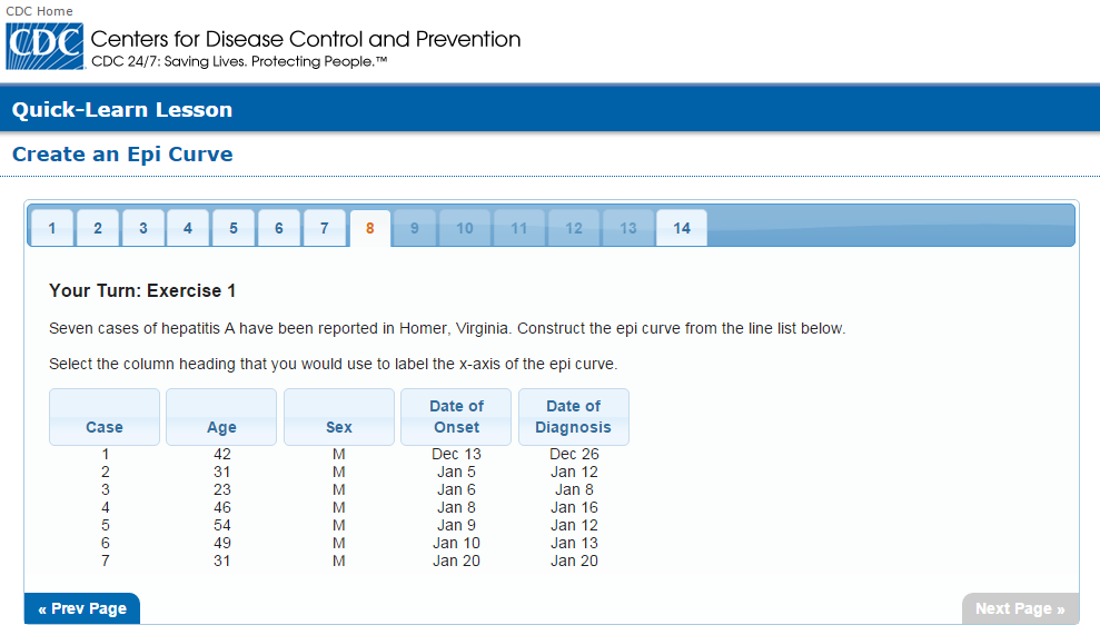
 This news story also includes a link to a learning module from the CDC. It takes the user through the process of creating an Epi curve. Slides 1-8 describe the creation of the curve, and slides 9-14 ask questions and provide interactive feedback that reinforces the lesson about creating Epi curves.

Graphs are useful for conveying data, but even one of our out staples, the bar graph, can be specialized as they share information about the way that disease spread.
1) Demonstrates statistics being used in a field that isn't explicitly statistics-y.
2) A little course online via the CDC for your students to learn to make epi curves.