NYT's "Is It Safer to Visit a Coffee Shop or a Gym?"

Katherine BaickerOeindrila DubeSendhil MullainathanDevin Pope, and 

How to use this in class: 
 
1) Show your students how data can inform real-life problems. Or crises, like how to safely re-open stores during COVID-19.
2) Show your students how data can be used in creative ways to solve problems. The present argument uses cellphone location data.
3) Show your students data viz in real life: Here, scatterplots that really improve the #scicomm potential of this piece.
4) Show your students the research process of making an initial argument and then conducting a follow-up study to answer lingering questions.


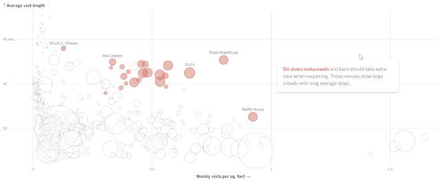
1) Data to solve problems: This example demonstrates how data can be used in ways it was never intended to inform real-life issues. Here, cell phone location data is being used to create a sort of ratio that might provide guidance in the relative risk associated with different kinds of shopping and stores. 

NYT scatter plot highlighting the risk associated with sit-down restaurants.
And there is more to be gleaned from this data than is shared via the data visualization, data that argues that industry-wide recommendations may not accurately address the risk associated with different businesses within an industry:

Data discovers that not all restaurants are the same.
2) Novel data for novel problems: The authors gathered cell phone location data from before COVID-19. A good example of data mining. Here are their methods:

Research methods for article


3) The data is presented as a scatterplot+. Why the +? It is interactive in that you can cursor over the circles to see the source of the data. Also, circle size corresponds with the number of locations for a given business. I think that data visualization is a vital tool that helps to clarify and simplify complicated concepts. The use of scatterplots in this article improves communication.

4) Scientific thinking and follow-up studies: The authors realized that their original data looking at a) time spent and b) visits per week x square footage didn't take into account every way the disease spreads. Specifically, the virus can live for a long time on surfaces. As a follow-up study, the authors asked people to estimate a) their level of human interaction/touching of shared surfaces and b) how much of the visit was spent indoors or out of doors. This provides an excellent example of the iterative process of science. 
 
Graph displaying follow-up study: How much time is spent outside?


Popular posts from this blog

Ways to use funny meme scales in your stats classes

Have you ever heard of the theory that there are multiple people worldwide thinking about the same novel thing at the same time? It is the multiple discovery hypothesis of invention . Like, multiple great minds around the world were working on calculus at the same time. Well, I think a bunch of super-duper psychology professors were all thinking about scale memes and pedagogy at the same time. Clearly, this is just as impressive as calculus. Who were some of these great minds? 1) Dr.  Molly Metz maintains a curated list of hilarious "How you doing?" scales.  2) Dr. Esther Lindenström posted about using these scales as student check-ins. 3) I was working on a blog post about using such scales to teach the basics of variables.  So, I decided to create a post about three ways to use these scales in your stats classes:  1) Teaching the basics of variables. 2) Nominal vs. ordinal scales.  3) Daily check-in with your students.  1. Teach your students the basics...

Leo DiCaprio Romantic Age Gap Data: UPDATE

Does anyone else teach correlation and regression together at the end of the semester? Here is a treat for you: Updated data on Leonardo DiCaprio, his age, and his romantic partner's age when they started dating. A few years ago, there was a dust-up when a clever Redditor r/TrustLittleBrother realized that DiCaprio had never dated anyone over 25. I blogged about this when it happened. But the old data was from 2022. Inspired by this sleuthing,  I created a wee data set, including up-to-date information on his current relationship with Vittoria Ceretti, so your students can suss out the patterns that exist in this data.

Tyler Vigen's Spurious Correlations

Tyler Vigen has has created  a long list of easy-to-paste-into-a-powerpoint graphs that illustrate that correlation does not equal causation. For instance, while per capita consumption of cheese and number of people who die by become tangled in their bed sheets may have a strong relationship (r = 0.947091), no one is saying that cheese consumption leads to bed sheet-related death. Although, you could pose The Third Variable question to your students for some of these relationships). Property of Tyler Vigens, http://i.imgur.com/OfQYQW8.png Vigen has also provided a menu of frequently used variables (deaths by tripping, sunlight by state) to help you look for specific examples. This portion is interactive, as you and your students can generate your own graphs. Below, I generated a graph of marriage rates in Pennsylvania and consumption of high fructose corn syrup. Generated at http://www.tylervigen.com/