
The writer helped out a PhD candidate by participating in his research, and then described the research process for io9.com readers. I like this because it is describes the research process purely from the perspective of the research participant who doesn't know what the exact hypothesis is.

This could be useful for explaining what research participation is like for introductory students. You could used it in a methods class by asking the students to figure out why they used the procedures that they did, and what procedures and scales she describes in her narrative. She describes the informed consent, a personality scale (what do you think the personality scale was trying to assess?), and rating stimuli in two ways (brain scan as well as paper and pencil assessment...why do you think they needed both?)
Details to Like:
-She is participating is psychology research (neruo. work that may benefit those with PTSD someday)
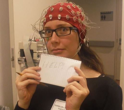
-She describes what is entailed when wearing an electrode cap
-Taking baseline measurements, including personality scales
-She provided a rating of the pictures when she was offline
-Mention informed consent in passing
This could be useful for explaining what research participation is like for introductory students. You could used it in a methods class by asking the students to figure out why they used the procedures that they did, and what procedures and scales she describes in her narrative. She describes the informed consent, a personality scale (what do you think the personality scale was trying to assess?), and rating stimuli in two ways (brain scan as well as paper and pencil assessment...why do you think they needed both?)
Details to Like:
-She is participating is psychology research (neruo. work that may benefit those with PTSD someday)
-She describes what is entailed when wearing an electrode cap
-Taking baseline measurements, including personality scales
-She provided a rating of the pictures when she was offline
-Mention informed consent in passing