Consumer Affairs released a list of America's best and worst drivers. It is a short article but contains many good stats nuggets.
1. Ratio and ordinal versions of the same data.
2. Where did the ratio data come from? Take a look at the Methodology.
3. Here is the data for the twenty most terrible drivers. It includes the nominal/ratio data I shared above and the top four bullet points from the image above.
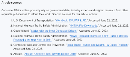
4. Where did they find their data? Lucky for us, they cite their data. Which is good form, right? But also, it is an example of how much hecking data is out there.


Comments
Post a Comment