
Washington Posts's "GAO says there is no evidence that a TSA program to spot terrorists is effective" (Update: 3/25/15)
The Travel Security Agency implemented SPOT training in order to teach air port security employees how to spot problematic and potentially dangerous individuals via behavioral cues. This intervention has cost the U.S. government $1 billion+. It doesn't seem to work.
By discussing this with your class, you can discuss the importance of program evaluations as well as validity and reliability. The actual government issued report goes into great detail about how the program evaluation data was collected to demonstrate that SPOT isn't working. The findings (especially the table and figure below) do a nice job of demonstrating the lack of reliability and the lack of validity. This whole story also implicitly demonstrates that the federal government is hiring statisticians with strong research methods backgrounds to conduct program evaluations (= jobs for students).
Here is a summary of the report from the Washington Post.
Here is a short summary and video about the report from CBS.
Here is the actual report.
UPDATE (3/25/15): As reported by Brian Naylor (for NPR), the ACLU is suing for access to this efficacy data. They argue that the SPOT program has led to racial profiling and they filed a Freedom of Information Act petition in order to examine the data themselves. This update also describes in greater detail the debate about whether or not people are very good lie detectors and includes a brief interview with psychologists Nicholas Eppley and Anne Kring, making this a good applied social psychology example.
By discussing this with your class, you can discuss the importance of program evaluations as well as validity and reliability. The actual government issued report goes into great detail about how the program evaluation data was collected to demonstrate that SPOT isn't working. The findings (especially the table and figure below) do a nice job of demonstrating the lack of reliability and the lack of validity. This whole story also implicitly demonstrates that the federal government is hiring statisticians with strong research methods backgrounds to conduct program evaluations (= jobs for students).
Here is a summary of the report from the Washington Post.
Here is a short summary and video about the report from CBS.
Here is the actual report.
 |
| This table from the official report demonstrates a lack of inter-rater reliability. |
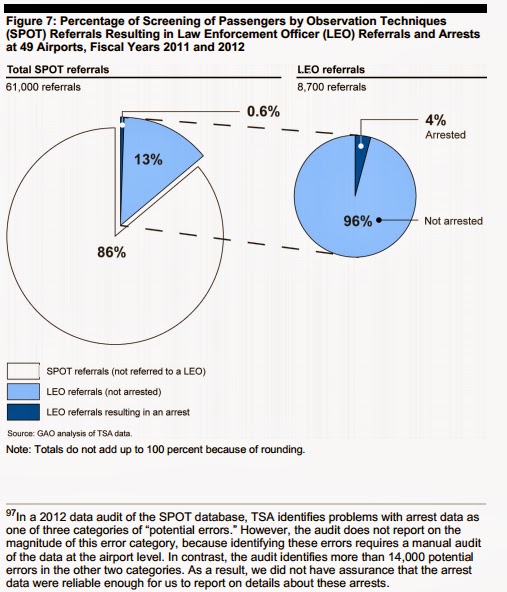 |
| This figure from the report demonstrates a lack of validity in terms of SPOT leading to arrests (also demonstrates the concept of false positives/Type I error) |
UPDATE (3/25/15): As reported by Brian Naylor (for NPR), the ACLU is suing for access to this efficacy data. They argue that the SPOT program has led to racial profiling and they filed a Freedom of Information Act petition in order to examine the data themselves. This update also describes in greater detail the debate about whether or not people are very good lie detectors and includes a brief interview with psychologists Nicholas Eppley and Anne Kring, making this a good applied social psychology example.