
Slate's The Littlest Tasters
More research methods than statistics, this article describes the difficulty in determining taste preferences in wee humans who don't speak well if at all.
The goods for teaching: They mention the FACE scale. The research methods described go beyond marketing research and this could be useful in a Developmental class to describe approaches used in data collection for children (like asking parents to rate their children's reactions to foods). I've used this as a discussion board prompt when discussing research ethics, both for simply conducting research with children as well as the ethics of marketing (not so healthy foods) towards children.
Aside: They also describe why kids like Lunchables, which has always been a mystery to me. Apparently, kids are picky about texture and flavor but they haven't developed a preference for certain foods to be hot or cold.
The Huffington Post's "You'll Never Look at Cereal Boxes the Same Way Again."
This post is related, in that research has found evidence that suggests that marketers are thinking of their littlest consumers when they design cereal boxes. Specifically, it appears that a) that cereals marketed towards children are placed on middle shelves in supermarket aisles and b) cereal box designers are strategically making cartoon characters on boxes of cereal gaze at children (based upon their middle-shelf placement). The researchers also found that adults feel a greater sense of brand trust and connection to the brand when boxes were designed so that the cereal box made eye contact with them (see example below).
The HuffPo link contains a video that describes the study. Here is a link to the lengthy description of the in-press study directly from Cornell.
Finally, The Onion's take on the Cornell research.
More research methods than statistics, this article describes the difficulty in determining taste preferences in wee humans who don't speak well if at all.
 |
| slate.com |
Aside: They also describe why kids like Lunchables, which has always been a mystery to me. Apparently, kids are picky about texture and flavor but they haven't developed a preference for certain foods to be hot or cold.
The Huffington Post's "You'll Never Look at Cereal Boxes the Same Way Again."
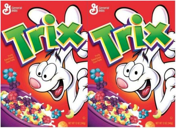
This post is related, in that research has found evidence that suggests that marketers are thinking of their littlest consumers when they design cereal boxes. Specifically, it appears that a) that cereals marketed towards children are placed on middle shelves in supermarket aisles and b) cereal box designers are strategically making cartoon characters on boxes of cereal gaze at children (based upon their middle-shelf placement). The researchers also found that adults feel a greater sense of brand trust and connection to the brand when boxes were designed so that the cereal box made eye contact with them (see example below).
 |
| from slate.com |
The HuffPo link contains a video that describes the study. Here is a link to the lengthy description of the in-press study directly from Cornell.
Finally, The Onion's take on the Cornell research.