
The thing about my way of teaching stats is that my cool, novel examples get old really fast. Like, pop culture is on a thirty-day cycle. Anyway, YEARS ago, 2014 to be exact, I blogged about illustrating bimodal data distributions using baby name data from the Social Security Administration. Specifically, when an older name comes back into vogue, it has a bimodal distribution when you plot time on the X axis. I stand by this example. However, all of the data illustrations come from 2014. When our traditionally aged college students were 6 or 7. Which makes this example feel a little stale. However, here is some data, courtesy of Redditor fevaah , showing old names that are back in vogue through 2025 ! And Eleanor, Violet, Nora, and Hazel are here, illustrating bimodal distributions for a new generation. If you used my old baby-name data, this is a quick, easy refresh for your lectures (or a fun new addition if you didn't). If this idea was help...
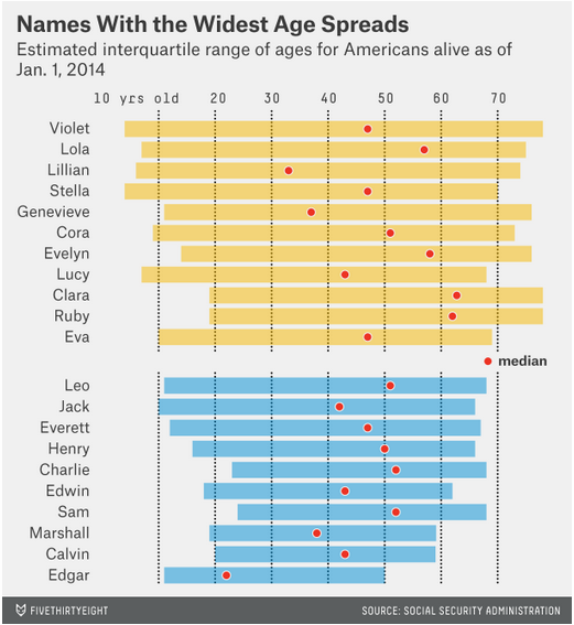
Nate Silver and Allison McCann (reporting for Five Thirty Eight, created graphs displaying baby name popularity over time. The data and graphs can be used to illustrate bimodality, variability, medians, interquartile range, and percentiles.
For example, the pattern of popularity for the name Violet illustrates bimodality and illustrates why measures of central tendency are incomplete descriptors of data sets:

For example, the pattern of popularity for the name Violet illustrates bimodality and illustrates why measures of central tendency are incomplete descriptors of data sets:
"Other names have unusual distributions. What if you know a woman — or a girl — named Violet? The median living Violet is 47 years old. However, you’d be mistaken in assuming that a given Violet is middle-aged. Instead, a quarter of Violets are older than 78, while another quarter are younger than 4. Only about 4 percent of Violets are within five years of 47."
Relatedly, bimodality (resulting from the current trend of giving classic, old-lady names to baby girls) can result in massive variability for some names...
...versus trendy baby names that have smaller interquartile ranges...
 |
| Your blogger exceeds the 75th percentile for Jessica Age. She considers herself a trendsetter, not old for her name. |