
The thing about my way of teaching stats is that my cool, novel examples get old really fast. Like, pop culture is on a thirty-day cycle. Anyway, YEARS ago, 2014 to be exact, I blogged about illustrating bimodal data distributions using baby name data from the Social Security Administration. Specifically, when an older name comes back into vogue, it has a bimodal distribution when you plot time on the X axis. I stand by this example. However, all of the data illustrations come from 2014. When our traditionally aged college students were 6 or 7. Which makes this example feel a little stale. However, here is some data, courtesy of Redditor fevaah , showing old names that are back in vogue through 2025 ! And Eleanor, Violet, Nora, and Hazel are here, illustrating bimodal distributions for a new generation. If you used my old baby-name data, this is a quick, easy refresh for your lectures (or a fun new addition if you didn't). If this idea was help...
This is a lot of I/O and personality a little bit of stats. But it does demonstrate correlation and percentiles, and it is interactive.
For this article from Time, Johnson and Wilson used participant scores on a very popular vocational selection tool, the Holland Inventory (sometimes called the RAISEC), and participant salary information to see if there is a strong relationship between salary and personality-job fit. There is not.
 How to use in class:
-Show your students what a weak correlation looks like when expressed via scatter plot. Seriously. I spend a lot of time looking for examples for teaching statistics. And there are all sorts of significant positive and negative correlation examples out there. But good examples of non-relationships are a lot rarer.
-If you teach I/O, this fits nicely into personality-job fit lecture. If you don't teach I/O but are a psychologist, this still applies to your field and may introduce your students to the field of I/O.
-This example is interactive in a few ways. Johnson and Wilson got this data from a previous Time article that included the RAISEC survey. The survey, via Time, also returns the respondents' results. It makes the example more self-relevant, and also gives your students a bit of vocational advice.
Additionally, there is a search feature to look up a job title and find the personality-job fit percentile for a given job. Or, you can cursor over any of the dots on the scatter plot to get the job title, salary, and personality-job fit for that job title.
-Median: The scatter plot includes the median fit score on the x-axis.
-Percentiles: The article contains information on what percentage of people experience greater person:job fit than given occupations, thus demonstrating percentiles.
For this article from Time, Johnson and Wilson used participant scores on a very popular vocational selection tool, the Holland Inventory (sometimes called the RAISEC), and participant salary information to see if there is a strong relationship between salary and personality-job fit. There is not.

-Show your students what a weak correlation looks like when expressed via scatter plot. Seriously. I spend a lot of time looking for examples for teaching statistics. And there are all sorts of significant positive and negative correlation examples out there. But good examples of non-relationships are a lot rarer.
-If you teach I/O, this fits nicely into personality-job fit lecture. If you don't teach I/O but are a psychologist, this still applies to your field and may introduce your students to the field of I/O.
-This example is interactive in a few ways. Johnson and Wilson got this data from a previous Time article that included the RAISEC survey. The survey, via Time, also returns the respondents' results. It makes the example more self-relevant, and also gives your students a bit of vocational advice.
Additionally, there is a search feature to look up a job title and find the personality-job fit percentile for a given job. Or, you can cursor over any of the dots on the scatter plot to get the job title, salary, and personality-job fit for that job title.
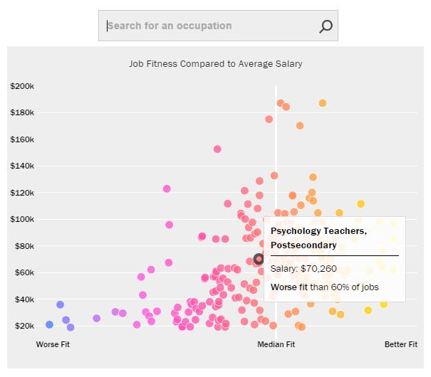 |
| You can also use the search feature to look up particular job titles. |
-Median: The scatter plot includes the median fit score on the x-axis.
-Percentiles: The article contains information on what percentage of people experience greater person:job fit than given occupations, thus demonstrating percentiles.
 |
| This list demonstrates percentiles (but doesn't use the word percentiles!) for the highest paid, worst fitting jobs. |