
Our World in Data is an impressive, creative-commons licensed site managed by Max Roser.
And it lives up to its name. The website provides all kinds of international data, divided by country, topic (population, health, food, growth & inequality, work, and life, etc.), and, when available, year. It contains its own proprietary data visualizations, which typically feature international data for a topic. You can customize these visualizations by nation. You can also DOWNLOAD THE DATA that has been visualized for use in the classroom.
Much of the data can be visualized as a map and progress, year by year, through the data, like this data on international human rights.
There are also plenty of topics of interest to psychologists who aren't teaching statistics.
For example, international data on suicide:
Working hours for I/O psychologists:
Data on specific hate crimes (here, lynching) for social psychology:
How to use in class:
And it lives up to its name. The website provides all kinds of international data, divided by country, topic (population, health, food, growth & inequality, work, and life, etc.), and, when available, year. It contains its own proprietary data visualizations, which typically feature international data for a topic. You can customize these visualizations by nation. You can also DOWNLOAD THE DATA that has been visualized for use in the classroom.
Much of the data can be visualized as a map and progress, year by year, through the data, like this data on international human rights.
 |
| https://ourworldindata.org/human-rights/ |
 |
| https://ourworldindata.org/human-rights/ |
There are also plenty of topics of interest to psychologists who aren't teaching statistics.
For example, international data on suicide:
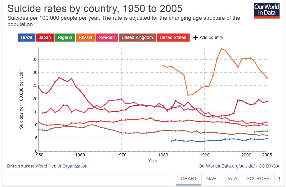 |
| Data for psychology courses...https://ourworldindata.org/suicide/ |
Working hours for I/O psychologists:
 |
| https://ourworldindata.org/working-hours/ |
Data on specific hate crimes (here, lynching) for social psychology:
 |
| https://ourworldindata.org/treatment-of-minorities |
How to use in class:
-Not all graphs are appropriate for all data and all of the ways we use data. When might the mapping of data work well? When would it be better to show changes in data per country over time?
-For each of the visualizations, you can also click on "DATA" if you want your students to work with the data on their own.
-The website beautifully demonstrates how to tell a story and build an argument using descriptive data. I know that I emphasized the data visualization/data download piece, but a story is told for each subtopic. In addition to using their own visualizations, the website frequently references and cites outside data sources and visualizations.
-For each of the visualizations, you can also click on "DATA" if you want your students to work with the data on their own.
-The website beautifully demonstrates how to tell a story and build an argument using descriptive data. I know that I emphasized the data visualization/data download piece, but a story is told for each subtopic. In addition to using their own visualizations, the website frequently references and cites outside data sources and visualizations.