
The thing about my way of teaching stats is that my cool, novel examples get old really fast. Like, pop culture is on a thirty-day cycle. Anyway, YEARS ago, 2014 to be exact, I blogged about illustrating bimodal data distributions using baby name data from the Social Security Administration. Specifically, when an older name comes back into vogue, it has a bimodal distribution when you plot time on the X axis. I stand by this example. However, all of the data illustrations come from 2014. When our traditionally aged college students were 6 or 7. Which makes this example feel a little stale. However, here is some data, courtesy of Redditor fevaah , showing old names that are back in vogue through 2025 ! And Eleanor, Violet, Nora, and Hazel are here, illustrating bimodal distributions for a new generation. If you used my old baby-name data, this is a quick, easy refresh for your lectures (or a fun new addition if you didn't). If this idea was help...
I have spent many a summer day at Rehoboth Beach, DE. The seagulls there were assholes. They would aggressively go after food, especially your bucket of Thrasher's french fries.

Apparently, this is a global problem, as a group of stalwart researchers in the UK attempted to dissuade gulls from stealing french fries by staring those sons-of-a-gun down. Researchers Goumas, Burns, Kelley, and Boogert shared their data. And it makes for a nice t-test example.
1. The Method section is hilarious and true.
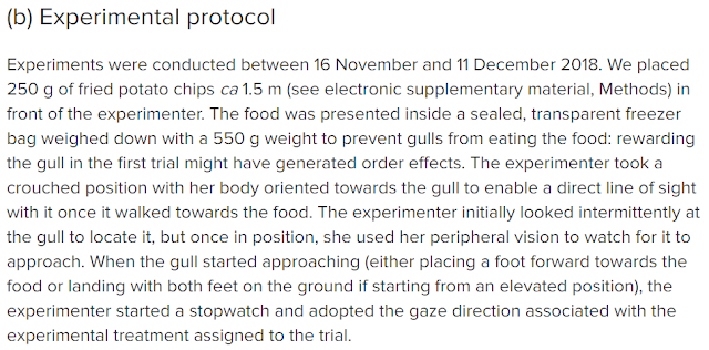
2. Within-subject design: Each seagull was observed in the stare down and non-staredown condition

3. Their figure is a nice example of the data visualization trend of illustrating individual data points.


Apparently, this is a global problem, as a group of stalwart researchers in the UK attempted to dissuade gulls from stealing french fries by staring those sons-of-a-gun down. Researchers Goumas, Burns, Kelley, and Boogert shared their data. And it makes for a nice t-test example.
1. The Method section is hilarious and true.
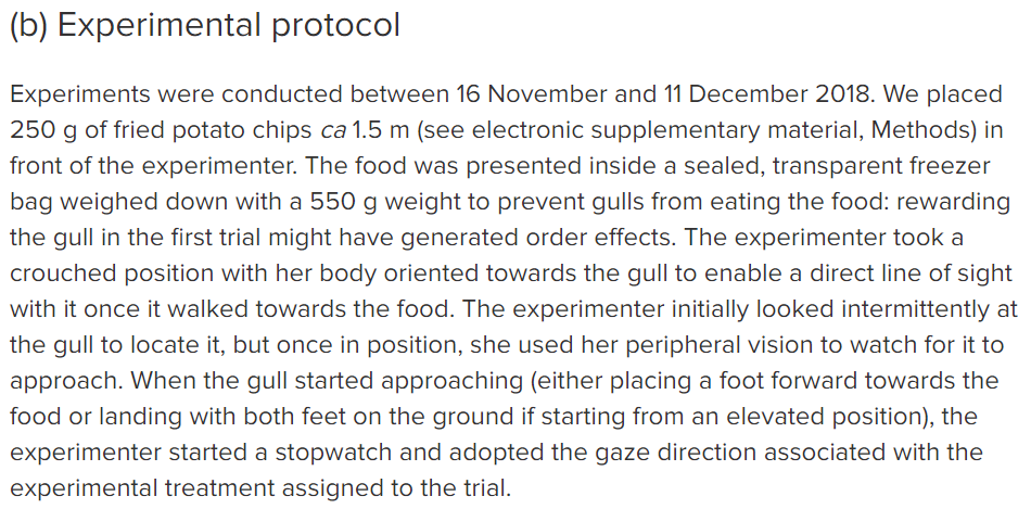
2. Within-subject design: Each seagull was observed in the stare down and non-staredown condition

3. Their figure is a nice example of the data visualization trend of illustrating individual data points.

4. The researchers shared their data. You can download it here. The Goumas et al. supplemental data can be used as a paired t-test example, t(18) = 3.13, p = .006, d = 0.717.