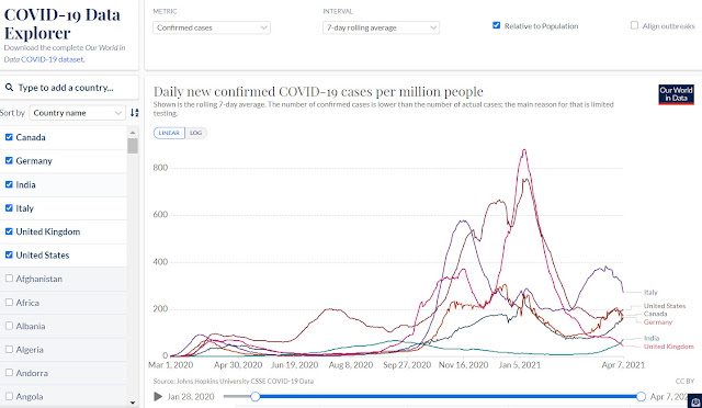
I've blogged about Our World in Data before. There is a lot to appreciate at this webiste, but I would like to draw your attention to the wealth of interactive COVID visualizations you can create. Many of these visualizations include a toggle button that changes the graph from a logarithmic graph to a linear graph. Which really, really helps illustrate log data transformations to our novice statisticians.
There have been occasional dust-ups over the last year with people not understanding the difference or being unfamiliar with log transformations, or graphs not being appropriately labeled.
I also like this example because most of my examples skew towards American content, but this data visualization tool lets you select from many countries.


Comments
Post a Comment