
Descriptive data example (and more) from Crisis Text Hotline

This blog post was inspired by the brilliant Leslie Berntsen. Her ACT 2021 presentation, "I'm not a therapist: Mental health education and advocacy for non-clinicians," was about teaching and sharing sound practices in mental health care when you, yourself, are not a mental-health-care-type-psychologist. 

Anyway, she had this really great idea about sharing user/trends/etc. data from the Crisis Text Line (CTL) with students. CTL is a text-based mental health crisis hotline. It is staffed 24/7. I include it on my syllabus as a resource for my struggling students because, unlike my uni's very hard-working counseling center, CTL is always available. 


Image from https://www.crisistextline.org/
https://www.crisistextline.org/


Why share data from CTL in your stats class? Because you can use it to a) teach a bit of stats, b) introduce students who need this resource to the resource, c) introduce potential volunteers to the service. Here are my ideas for how you could use this data in class.

1. Data visualizations to tell a story:

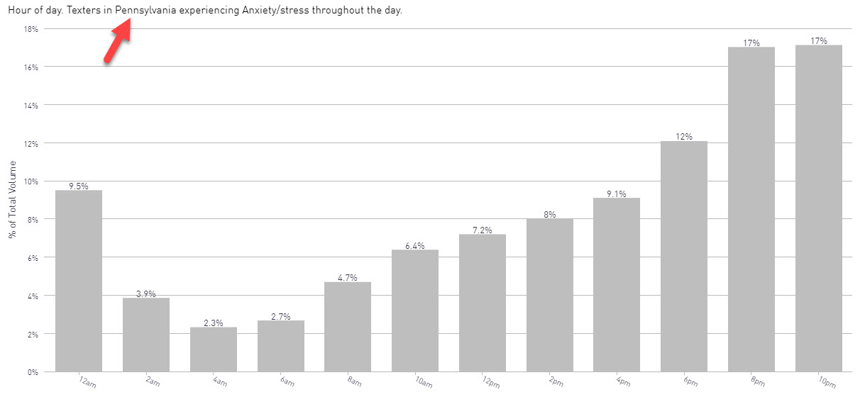
Line graphs of hotline use over time (customizable by crisis type):

https://crisistrends.org/

Bar graphs of hotline use by the time of day (customizable by crisis type and state)


https://crisistrends.org/

Heat map of state rankings (customizable by crisis type):

https://crisistrends.org/


2. The CTH data illustrates how clinical psychologists may use data to inform practice:

Sometimes, psychological statistics students don't see how stats can improve clinical practices. Of course, we know that they do via traditional research, but CTH uses data for training (hey, I/O psychologists!), improves service, and predicts when the service will be used more heavily. 

Image from https://www.crisistextline.org/data-philosophy/, listing the internal uses of CTH data.
https://www.crisistextline.org/data-philosophy/

3. You can apply for access to their data and analyze it yourself. I'm sure some of you clever people could turn this into a fantastic class project.

4. You never know who needs help. Or know someone who needs help. By sharing this data, you are sharing the resource.

5. You also never know which of your students are looking for an internship or volunteer opportunity. I think this one is especially helpful since a student can set their own hours AND all they need is a cell phone. This might be particularly useful for students with care-giving duties or physical limitations. 

If you really want to deep dive, you can even sign up as a collaborator and gain access to their data.

If you are looking for a pop article to introduce this topic, Mashable did a good summary of the data they collected.

Comments

Post a Comment

Popular posts from this blog

Ways to use funny meme scales in your stats classes

Have you ever heard of the theory that there are multiple people worldwide thinking about the same novel thing at the same time? It is the multiple discovery hypothesis of invention . Like, multiple great minds around the world were working on calculus at the same time. Well, I think a bunch of super-duper psychology professors were all thinking about scale memes and pedagogy at the same time. Clearly, this is just as impressive as calculus. Who were some of these great minds? 1) Dr.  Molly Metz maintains a curated list of hilarious "How you doing?" scales.  2) Dr. Esther Lindenström posted about using these scales as student check-ins. 3) I was working on a blog post about using such scales to teach the basics of variables.  So, I decided to create a post about three ways to use these scales in your stats classes:  1) Teaching the basics of variables. 2) Nominal vs. ordinal scales.  3) Daily check-in with your students.  1. Teach your students the basics...

Using pulse rates to determine the scariest of scary movies

  The Science of Scare project, conducted by MoneySuperMarket.com, recorded heart rates in participants watching fifty horror movies to determine the scariest of scary movies. Below is a screenshot of the original variables and data for 12 of the 50 movies provided by MoneySuperMarket.com: https://www.moneysupermarket.com/broadband/features/science-of-scare/ https://www.moneysupermarket.com/broadband/features/science-of-scare/ Here is my version of the data in Excel format . It includes the original data plus four additional columns (so you can run more analyses on the data): -Year of Release -Rotten Tomato rating -Does this movie have a sequel (yes or no)? -Is this movie a sequel (yes or no)? Here are some ways you could use this in class: 1. Correlation : Rotten Tomato rating does not correlate with the overall scare score ( r = 0.13, p = 0.36).   2. Within-subject research design : Baseline, average, and maximum heart rates are reported for each film.   3. ...

Andy Field's Statistics Hell

Andy Field is a psychologist, statistician, and author. He created a funny, Dante's Inferno-themed  web site that contains everything you ever wanted to know about statistics. I know, I know, you're thinking, "Not another Dante's Inferno themed statistics web site!". But give this one a try. Property of Andy Field. I certainly can't take credit for this. Some highlights: 1) The aesthetic is priceless. For example, his intermediate statistics page begins with the introduction, "You will experience the bowel-evacuating effect of multiple regression, the bone-splintering power of ANOVA and the nose-hair pulling torment of factor analysis. Can you cope: I think not, mortal filth. Be warned, your brain will be placed in a jar of cerebral fluid and I will toy with it at my leisure." 2) It is all free. Including worksheets, data, etc. How amazing and generous. And, if you are feeling generous and feel the need to compensate him for the website, ...