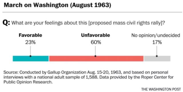
Elahe Izadi, writing for The Washington Post, shared polling data from the 1960s. The data focused on public opinion about different aspects of the civil rights movement (March on Washington, freedom riders, etc.). The old data was used to draw parallels between the mixed support for the Civil Rights Movement of the 1960s and the mixed support for current civil rights protests, specifically, Black Lives Matter.
Here is the Washington Post story on the polling data, the civil rights movement, and Black Lives Matter. The story is the source of all the visualizations contained below. Here is the original polling data.
I think this is timely data. And it can be used to point out a lot of things:
1) Polling data (and jobs) have been around for a long time: We may be in the era of Big Data, but polling data has been around for a long, long time. And Gallup, the organization that gathered some of this data, has been around for a long, long time and may hire your baby statisticians someday. Statisticians and researchers do more than run analyses all day: They work with clients (here, Gallup worked for Newsweek) to organize massive data collections to better understand social issues.
2) Data can inform just about anything: This data informs our understanding of history. Typically, the two fields seem very separated, but this time, they aren't. This makes it another larger example of how data might be useful to our students outside of the classroom: It can be used to inform debate and enrich our perspective of current events and history.
3) A clean, easy to read example of a stacked bar graph.
Here is the Washington Post story on the polling data, the civil rights movement, and Black Lives Matter. The story is the source of all the visualizations contained below. Here is the original polling data.
 |
| https://img.washingtonpost.com/wp-apps/imrs.php?src=https://img.washingtonpost.com/blogs/the-fix/files/2016/04/2300-galluppoll1961-1024x983.jpg&w=1484 |
 |
| https://img.washingtonpost.com/wp-apps/imrs.php?src=https://img.washingtonpost.com/blogs/the-fix/files/2016/04/2300-galluppoll1963-1024x528.jpg&w=1484 |
I think this is timely data. And it can be used to point out a lot of things:
1) Polling data (and jobs) have been around for a long time: We may be in the era of Big Data, but polling data has been around for a long, long time. And Gallup, the organization that gathered some of this data, has been around for a long, long time and may hire your baby statisticians someday. Statisticians and researchers do more than run analyses all day: They work with clients (here, Gallup worked for Newsweek) to organize massive data collections to better understand social issues.
2) Data can inform just about anything: This data informs our understanding of history. Typically, the two fields seem very separated, but this time, they aren't. This makes it another larger example of how data might be useful to our students outside of the classroom: It can be used to inform debate and enrich our perspective of current events and history.
3) A clean, easy to read example of a stacked bar graph.


Nice information.. i like your blog. :)
ReplyDelete