
Suicide hotline efficacy data: Assessment, descriptive data, t-tests, correlation, regression examples abound

ASIDE: THIS IS MY 500th POST. PLEASE CLAP.

Efficacy data about a mental health intervention? Yes, please. The example has so much potential in a psych stats classroom. Or an abnormal/clinical classroom, or research methods. Maybe even human factors, because three numbers are easy to remember than 10?

This post was inspired by an NPR story by Rhitu Chatterjee.

It is all about America's mental health emergency hotline's switch from a 10-digit phone number to the much easier-to-remember three digits (988), and the various ways that the government has measured the success of this change.

How to use this (and related material) in class:

1) Assessment.

In the NPR interview, the describe how several markers have improved: Wait times, dropped calls, etc. 

Okay, so the NPR story sent me down a rabbit hole of looking for this data so we can use it in class. Here is the federal government's website about 988 and a link to their specific 988 performance data, which is a nice demonstration of simple descriptive data as well as assessment data. 

Descriptive data for 988, in a table labeled "988 Lifeine Routed Network Contacts (Excludes VCL*): 371,655
https://www.samhsa.gov/find-help/988/performance-metrics


2) This data is available.

I can imagine many tests you can run looking at the data aggregated by state, found here at 988's website. Here is a screenshot of one of their monthly reports, with the previously mentioned descriptive statistics divided up by state/territory.

A table that displays assessment data divided by state/territory
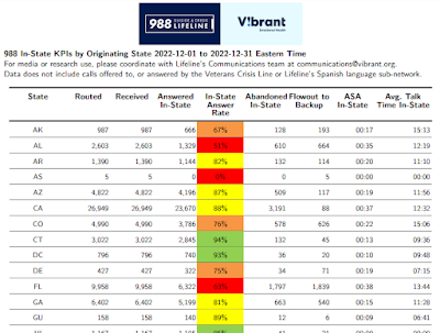
https://988lifeline.org/wp-content/uploads/2023/01/FINAL-2022-12_988-State-Report-1.pdf

Yes, you need to convert this to a .CSV. Or you can just use this copy of the Dec22 data, in which I also converted all of the times from minutes:seconds to seconds. But after you do that...

Your students can perform a paired t-test on any of the monthly reports. How? Find two months. Compare all of the states/territory performance between the two months. You can have your students replicate the exact data that Chatterjee mentions in her report.

For any given month's data, you could run a correlation and/or regression between any of the quanty variables. 

And if you are fancy, you could teach repeated measure design with this data as well, using multiple months' data.

You could practice data visualization with this data as well.

3) Share a fantastic resource with your students. I know I sound dramatic, but you could introduce this resource to a student who really needs it, or loves someone who really needs it. 

Comments

Popular posts from this blog

Ways to use funny meme scales in your stats classes

Have you ever heard of the theory that there are multiple people worldwide thinking about the same novel thing at the same time? It is the multiple discovery hypothesis of invention . Like, multiple great minds around the world were working on calculus at the same time. Well, I think a bunch of super-duper psychology professors were all thinking about scale memes and pedagogy at the same time. Clearly, this is just as impressive as calculus. Who were some of these great minds? 1) Dr.  Molly Metz maintains a curated list of hilarious "How you doing?" scales.  2) Dr. Esther Lindenström posted about using these scales as student check-ins. 3) I was working on a blog post about using such scales to teach the basics of variables.  So, I decided to create a post about three ways to use these scales in your stats classes:  1) Teaching the basics of variables. 2) Nominal vs. ordinal scales.  3) Daily check-in with your students.  1. Teach your students the basics...

Using pulse rates to determine the scariest of scary movies

  The Science of Scare project, conducted by MoneySuperMarket.com, recorded heart rates in participants watching fifty horror movies to determine the scariest of scary movies. Below is a screenshot of the original variables and data for 12 of the 50 movies provided by MoneySuperMarket.com: https://www.moneysupermarket.com/broadband/features/science-of-scare/ https://www.moneysupermarket.com/broadband/features/science-of-scare/ Here is my version of the data in Excel format . It includes the original data plus four additional columns (so you can run more analyses on the data): -Year of Release -Rotten Tomato rating -Does this movie have a sequel (yes or no)? -Is this movie a sequel (yes or no)? Here are some ways you could use this in class: 1. Correlation : Rotten Tomato rating does not correlate with the overall scare score ( r = 0.13, p = 0.36).   2. Within-subject research design : Baseline, average, and maximum heart rates are reported for each film.   3. ...

Andy Field's Statistics Hell

Andy Field is a psychologist, statistician, and author. He created a funny, Dante's Inferno-themed  web site that contains everything you ever wanted to know about statistics. I know, I know, you're thinking, "Not another Dante's Inferno themed statistics web site!". But give this one a try. Property of Andy Field. I certainly can't take credit for this. Some highlights: 1) The aesthetic is priceless. For example, his intermediate statistics page begins with the introduction, "You will experience the bowel-evacuating effect of multiple regression, the bone-splintering power of ANOVA and the nose-hair pulling torment of factor analysis. Can you cope: I think not, mortal filth. Be warned, your brain will be placed in a jar of cerebral fluid and I will toy with it at my leisure." 2) It is all free. Including worksheets, data, etc. How amazing and generous. And, if you are feeling generous and feel the need to compensate him for the website, ...