
Mara Liasson's "The challenges behind accurate opinion polls"


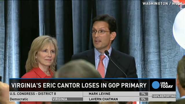
This radio story by Mara Liasson (reporting for NPR) discusses the surprising primary loss of former Republican House Majority Leader Eric Cantor. It was surprising because internal polling conducted by Cantor's team gave him an easy win, but he lost out to a Tea Party favorite, David Brat. The story goes on to describe why it is becoming increasingly difficult to conduct accurate voter polling via telephone and the internet.


Some specific points from this story that teach students about sampling techniques:

1) Sample versus population: One limitation of polling data is the fact that many telephone call-based sampling techniques include landlines and ignore the growing population of people who only have cell phones.
2) Response rates for political polling are on a decline, making the validity of the available sample shrink.
3) Robocalls, while less expensive, have no way of validating that an actual registered voter is responding to the questions. Additionally, restrictions on placing robocalls to cell phones (but not landlines) create more difficulties for pollsters.

I used this example as a way of introducing sampling error and, eventually, the distribution of the sampling mean/standard error.

I emphasized that Cantor's polling had been conducted by high-end polling firm McLaughlin and Associates (source). I also explained just how powerful Eric Cantor was and if an extraordinarily rich and powerful person using a very expensive polling firm has to contend with sampling error, then what does that say for the rest of us?

Comments

Popular posts from this blog

Ways to use funny meme scales in your stats classes

Have you ever heard of the theory that there are multiple people worldwide thinking about the same novel thing at the same time? It is the multiple discovery hypothesis of invention . Like, multiple great minds around the world were working on calculus at the same time. Well, I think a bunch of super-duper psychology professors were all thinking about scale memes and pedagogy at the same time. Clearly, this is just as impressive as calculus. Who were some of these great minds? 1) Dr.  Molly Metz maintains a curated list of hilarious "How you doing?" scales.  2) Dr. Esther Lindenström posted about using these scales as student check-ins. 3) I was working on a blog post about using such scales to teach the basics of variables.  So, I decided to create a post about three ways to use these scales in your stats classes:  1) Teaching the basics of variables. 2) Nominal vs. ordinal scales.  3) Daily check-in with your students.  1. Teach your students the basics...

Using pulse rates to determine the scariest of scary movies

  The Science of Scare project, conducted by MoneySuperMarket.com, recorded heart rates in participants watching fifty horror movies to determine the scariest of scary movies. Below is a screenshot of the original variables and data for 12 of the 50 movies provided by MoneySuperMarket.com: https://www.moneysupermarket.com/broadband/features/science-of-scare/ https://www.moneysupermarket.com/broadband/features/science-of-scare/ Here is my version of the data in Excel format . It includes the original data plus four additional columns (so you can run more analyses on the data): -Year of Release -Rotten Tomato rating -Does this movie have a sequel (yes or no)? -Is this movie a sequel (yes or no)? Here are some ways you could use this in class: 1. Correlation : Rotten Tomato rating does not correlate with the overall scare score ( r = 0.13, p = 0.36).   2. Within-subject research design : Baseline, average, and maximum heart rates are reported for each film.   3. ...

Andy Field's Statistics Hell

Andy Field is a psychologist, statistician, and author. He created a funny, Dante's Inferno-themed  web site that contains everything you ever wanted to know about statistics. I know, I know, you're thinking, "Not another Dante's Inferno themed statistics web site!". But give this one a try. Property of Andy Field. I certainly can't take credit for this. Some highlights: 1) The aesthetic is priceless. For example, his intermediate statistics page begins with the introduction, "You will experience the bowel-evacuating effect of multiple regression, the bone-splintering power of ANOVA and the nose-hair pulling torment of factor analysis. Can you cope: I think not, mortal filth. Be warned, your brain will be placed in a jar of cerebral fluid and I will toy with it at my leisure." 2) It is all free. Including worksheets, data, etc. How amazing and generous. And, if you are feeling generous and feel the need to compensate him for the website, ...