
Taylor, writing for Mashable, describes what happens when carefully conducted public health research (published in the Journal of the American Medical Association) becomes attention grabbing and poorly represented click bait.
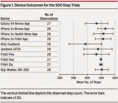
Data published in JAMA (Case, Burwick, Volpp, & Patel, 2015) tested the step-counting reliability of various wearable fitness tracking devices and smart phone apps (see the data below). In addition to checking the reliability of various devices, the article makes an argument that, from a public health perspective, lots of people have smart phones but not nearly as many people have fitness trackers. So, a way to encourage wellness may be to encourage people to use the the fitness capacities within their smart phone (easier and cheaper than buying a fitness tracker). The authors never argue that fitness trackers are bad, just that 1) some are more reliable than others and 2) the easiest way to get people to engage in more mindful walking might be via resources they already possess (in this case, smart phones).
But then the media went and got a hold of the research. The resulting headlines?
From Mother Jones:
From Jezebel:
Again, "science" never made that declaration. Sure, the Nike Fuelband doesn't seem to be very accurate but the Fitbit performed well on the tests. And, yes, cell phones may be just as accurate, but then you have to take your phone with you everywhere, which may not be ideal if you are wearing a dress without pockets or during your Zumba class.
How to use this in class: 1) Illustrate the gap between science and the reporting of science, 2) the research here is really easy for students to understand, 3) the data is displayed in nice, easy to follow graphs, and 4) be weary of click bait, especially as it applies to research findings.
Data published in JAMA (Case, Burwick, Volpp, & Patel, 2015) tested the step-counting reliability of various wearable fitness tracking devices and smart phone apps (see the data below). In addition to checking the reliability of various devices, the article makes an argument that, from a public health perspective, lots of people have smart phones but not nearly as many people have fitness trackers. So, a way to encourage wellness may be to encourage people to use the the fitness capacities within their smart phone (easier and cheaper than buying a fitness tracker). The authors never argue that fitness trackers are bad, just that 1) some are more reliable than others and 2) the easiest way to get people to engage in more mindful walking might be via resources they already possess (in this case, smart phones).
 |
| Image from JAMA |
But then the media went and got a hold of the research. The resulting headlines?
From Mother Jones:
 |
| http://www.motherjones.com/environment/2015/02/science-fitbit-fuelband-fitness-trackers-cellphone-health |
Nope. Nope, that isn't exactly it. AND...if anything, the Fitbits did pretty well in the experimental trials.
From Jezebel:
 |
| http://jezebel.com/your-fitbit-is-bullshit-says-science-1686024094 |
Again, "science" never made that declaration. Sure, the Nike Fuelband doesn't seem to be very accurate but the Fitbit performed well on the tests. And, yes, cell phones may be just as accurate, but then you have to take your phone with you everywhere, which may not be ideal if you are wearing a dress without pockets or during your Zumba class.
How to use this in class: 1) Illustrate the gap between science and the reporting of science, 2) the research here is really easy for students to understand, 3) the data is displayed in nice, easy to follow graphs, and 4) be weary of click bait, especially as it applies to research findings.