
Ben Blatt of Slate mined through Center for Disease control data in order to provide us with 13 different maps of the United States and mortality information for each state. Below, information on disproportionately high cases of death in each state.
While the maps are morbid and interesting, the story behind the maps (read the story here about how data can be easily misrepresented by maps) make this a good example of how easily data can be distorted.
The story along with the maps unveils several issues that statisticians/researchers must consider when they are presenting descriptive statistics. In this instance, Blatt had to sort through the data to eliminate the most common causes of death (heart disease, cancer, etc.) in order to uncover unique data for each state.

Relatedly, he highlights the fact that "disproportionately" does not mean "most":
Additionally, some of the maps highlight the difference between median and mean splits...

"It should be noted that each state’s rate is compared with the national average, not the median. That’s why it’s possible for 30 states to have more deaths than the national average."
Anyway, I think this could be useful in class because the title of the maps are interesting, but I think it also forces students to think about some unique issues in statistics.
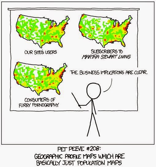
Or, put bluntly and in a manner inappropriate for the undergraduate classroom:
While the maps are morbid and interesting, the story behind the maps (read the story here about how data can be easily misrepresented by maps) make this a good example of how easily data can be distorted.
The story along with the maps unveils several issues that statisticians/researchers must consider when they are presenting descriptive statistics. In this instance, Blatt had to sort through the data to eliminate the most common causes of death (heart disease, cancer, etc.) in order to uncover unique data for each state.
Relatedly, he highlights the fact that "disproportionately" does not mean "most":
"But this map—like many maps which purport to show attributes meant to be “distinct” or “disproportionate”—can be misleading if not read properly. For one thing, you cannot make comparisons between states. Looking at this map, you probably would not guess that Utah has the sixth-highest diabetes rate in the country. Diabetes just happens to be the one disease that affects Utah most disproportionately. Louisiana has a higher diabetes death rate than any state, but is affected even more disproportionately by kidney disease."
Additionally, some of the maps highlight the difference between median and mean splits...
Anyway, I think this could be useful in class because the title of the maps are interesting, but I think it also forces students to think about some unique issues in statistics.
Or, put bluntly and in a manner inappropriate for the undergraduate classroom:
 |
| http://xkcd.com/1138/ |
Great post! Thank you so much for your information, it is very useful.
ReplyDeleteI'm glad you find it useful! Have a great day.
ReplyDelete