
If your students get the joke, they get statistics.

Gleaned from multiple sources (FB, Pinterest, Twitter, none of these belong to me, etc.). Remember, if your students can explain why a stats funny is funny, they are demonstrating statistical knowledge. I like to ask students to explain the humor in such examples for extra credit points (see below for an example from my FA14 final exam).

Using xkcd.com for bonus points/assessing if students understand that correlation =/= causation


What are the numerical thresholds for probability? 


How does this refer to alpha? What type of error is being described, Type I or Type II?


What measure of central tendency is being described?


Dilbert: http://search.dilbert.com/comic/Kill%20Anyone
Sampling, CLT


http://foulmouthedbaker.com/2013/10/03/graphs-belong-on-cakes/
Because control vs. sample, standard deviations, normal curves. Also,"skewed" pun. If you go to the original website, the story behind this cakes has to do with a section of crappy students...so that is kind of funny and therapeutic for us teachers.

NOTE: The website the cake example comes from contains a lot of NSFW language. Which I, personally, have no problem with, but you might.


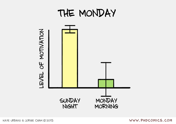
http://www.phdcomics.com/comics.php?f=1793
Because bar graphs, error bars, and understanding the joke behind this graph.


http://smbc-comics.com/index.php?id=3732
What kind of error, Type I or Type II?


http://wilwheaton.net/2015/11/wil-cant-draw-teachable-moment/
 Reliability, n-size


https://mathwithbaddrawings.com/2016/04/27/symbols-that-math-urgently-needs-to-adopt/
What does correlation give us? What does it not?


http://xkcd.com/1725/

What does the r^2 here indicate? Why would it be difficult to guess the direction of the relationship?


What is the joke here? For more rigor: What does et al. stand for? What are the APA rules for when to use et al.?


Comments

Post a Comment

Popular posts from this blog

Ways to use funny meme scales in your stats classes

Have you ever heard of the theory that there are multiple people worldwide thinking about the same novel thing at the same time? It is the multiple discovery hypothesis of invention . Like, multiple great minds around the world were working on calculus at the same time. Well, I think a bunch of super-duper psychology professors were all thinking about scale memes and pedagogy at the same time. Clearly, this is just as impressive as calculus. Who were some of these great minds? 1) Dr.  Molly Metz maintains a curated list of hilarious "How you doing?" scales.  2) Dr. Esther Lindenström posted about using these scales as student check-ins. 3) I was working on a blog post about using such scales to teach the basics of variables.  So, I decided to create a post about three ways to use these scales in your stats classes:  1) Teaching the basics of variables. 2) Nominal vs. ordinal scales.  3) Daily check-in with your students.  1. Teach your students the basics...

Rouse, Russel, & Campbell (2025) is a curated list of Psi Chi journals that are perfect for Intro Stats.

This summer, the Psi Chi Journal of Psychology Research published  Rouse, Russel, and Campbell's Beyond the textbook: Psi Chi Journal articles in introductory psychology courses. It is a curated list of paywall-free Psi Chi articles, mostly with student co-authors, that are peer-reviewed and of an appropriate writing level and length to use in an Introduction to Psychology course. The authors provide the following information for each of the articles: In addition to being appropriate for Into Psych, these articles are also perfect for Intro Stats. In my classes, I emphasize the ability to read and write simple result sections. One way I would review this skill is by showing my students Results sections from published research and asking them to identify the test statistics, effect size, and other relevant information. This selection of articles features clear and concise results sections for t -tests, ANOVA, factorial ANOVA, regression, and correlation. I created a spreadsheet...

Using pulse rates to determine the scariest of scary movies

  The Science of Scare project, conducted by MoneySuperMarket.com, recorded heart rates in participants watching fifty horror movies to determine the scariest of scary movies. Below is a screenshot of the original variables and data for 12 of the 50 movies provided by MoneySuperMarket.com: https://www.moneysupermarket.com/broadband/features/science-of-scare/ https://www.moneysupermarket.com/broadband/features/science-of-scare/ Here is my version of the data in Excel format . It includes the original data plus four additional columns (so you can run more analyses on the data): -Year of Release -Rotten Tomato rating -Does this movie have a sequel (yes or no)? -Is this movie a sequel (yes or no)? Here are some ways you could use this in class: 1. Correlation : Rotten Tomato rating does not correlate with the overall scare score ( r = 0.13, p = 0.36).   2. Within-subject research design : Baseline, average, and maximum heart rates are reported for each film.   3. ...