Quealy & Sanger-Katz's "Is Sushi ‘Healthy’? What About Granola? Where Americans and Nutritionists Disagree"
UPDATE, 9/22/22: Here is a non-paywalled link to this information: https://www.nytimes.com/2017/10/09/learning/whats-going-on-in-this-graph-oct-10-2017.html
This article from the NYT is based on a survey. That survey asked a bunch of nutritionists if they considered certain foods healthy. Then they asked a bunch of everyday folks if they considered the same foods to be healthy.
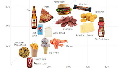
Then they generated the percentage of each group that considered the food healthy. And the NYT put the nutritionist responses on a Y-axis, and commoners on the X, and made a lovely scatterplot...
...and provided us with the raw data as well.
The article mostly highlights the foods where there is a large discrepancy of opinion between the two groups (see above).
There are many teachable moments in this article:
-Correlation. Obvs.
-Inter-rater reliability. Kind of. It is high when nutritionists and non-nutritionists agree, and low when they don't. When there is low reliability, the food becomes an outlier (so talk about outliers/influential observations).
-Lots of descriptive data is presented.
-If you wanted, you could conduct a paired t-test on this data. Compare nutritionist data to layperson data. This data is available in separate tables accompanying the story.
-While you are at it, run the correlation and generate the regression line.
-Discuss real-life application of this data. What are the commonalities for food that laypeople ID as unhealthy that actually are healthy? And vice-versa? How can the government concentrate on suggesting healthy, confusing food to laypeople?
Then they generated the percentage of each group that considered the food healthy. And the NYT put the nutritionist responses on a Y-axis, and commoners on the X, and made a lovely scatterplot...
 |
| Nutritionists and non-nutritionists agree that chocolate chip cookies are not healthy. However, nutritionists are far more critical of American cheese than are non-nutritionists. |
...and provided us with the raw data as well.
The article mostly highlights the foods where there is a large discrepancy of opinion between the two groups (see above).
There are many teachable moments in this article:
-Correlation. Obvs.
-Inter-rater reliability. Kind of. It is high when nutritionists and non-nutritionists agree, and low when they don't. When there is low reliability, the food becomes an outlier (so talk about outliers/influential observations).
-Lots of descriptive data is presented.
-If you wanted, you could conduct a paired t-test on this data. Compare nutritionist data to layperson data. This data is available in separate tables accompanying the story.
-While you are at it, run the correlation and generate the regression line.
-Discuss real-life application of this data. What are the commonalities for food that laypeople ID as unhealthy that actually are healthy? And vice-versa? How can the government concentrate on suggesting healthy, confusing food to laypeople?


Comments
Post a Comment