
The thing about my way of teaching stats is that my cool, novel examples get old really fast. Like, pop culture is on a thirty-day cycle. Anyway, YEARS ago, 2014 to be exact, I blogged about illustrating bimodal data distributions using baby name data from the Social Security Administration. Specifically, when an older name comes back into vogue, it has a bimodal distribution when you plot time on the X axis. I stand by this example. However, all of the data illustrations come from 2014. When our traditionally aged college students were 6 or 7. Which makes this example feel a little stale. However, here is some data, courtesy of Redditor fevaah , showing old names that are back in vogue through 2025 ! And Eleanor, Violet, Nora, and Hazel are here, illustrating bimodal distributions for a new generation. If you used my old baby-name data, this is a quick, easy refresh for your lectures (or a fun new addition if you didn't). If this idea was help...
One thing I like to emphasize to my students is that just because a scientist is using math and science and statistics, it doesn't mean they are unbiased. I usually describe how Sir RA Fisher love statistics, smoking, and white folks and, shock of shocks, produced data that supported both the safety of smoking and the soundness of eugenics.
For more on that: How Eugenics Shaped Statistics, by Clayton for Nautilus Magazine.
 |
| http://journals.sagepub.com/doi/abs/10.1177/0098628320979879 |
The article makes a sound argument: While social justice/bias issues may be present in other psychology courses, they need to be addressed in our stats classses as well.
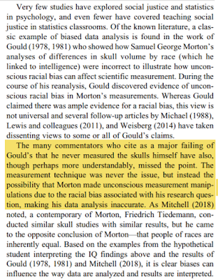
This journal article from Teaching of Psychology suggests that a lecture that highlights Samuel George Morton's "research" that investigated skull size and intelligence, as well as more modern examples of bias, leads to an increase of student scores on various social justice scales. To sum up the spirit of the article, see the highlighted bit below:
The group also highlighted more contemporary work. Here is a quick summary of what they shared in the experimental lecture, a lecture that they share as supplemental material:
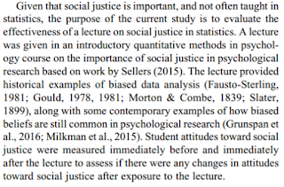
While I (and the authors of this piece) acknowledge that one lecture typically isn't enough to get any point across, including the lesson of bias is research...this is a good, engaging start to that journey for our psychology majors and statistics students.