Women's pockets are crap: An empirical investigation

The Pudding took a data-driven approach to test a popular hypothesis: Women's pockets are smaller than men's pockets. 

First image from the Pudding story on pocket size.

Authors Diehem and Thomas sent research assistants to measure the pockets on men's and women's jeans. They even shared supplemental materials, like the exact form the RAs completed.

Jean dimension data collection form
https://pudding.cool/2018/08/pockets/assets/images/MeasurementGuide.pdf

And they used fancy coding to figure out the exact dimensions of the jeans. Indeed, even when women are allowed pockets (I'm looking at you, dressmakers!), the pockets are still smaller than they are in men's jeans.
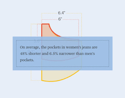
Summary data for the differences in men's and women's jeans

They came to the following conclusion:


Amen.

Anyway, there are a few ways you can use this in the classroom:

1) Look at how they had a hypothesis, and they tested that hypothesis. Reasonably, they used multiple versions of the same kind of pants. If you check out their data, you can see all of the data points they collected about each type of jeans. They even provide supplemental materials, like the data collection sheets, their data, and the code they used to figure out the dimension of each pocket. Honestly, that is good science and good transparency. 

2) They report the average pocket dimensions, so plenty of means to discuss.

3) They kindly shared their data. With the data they provide, you could conduct an independent t-test, comparing men's jeans and Women's jeans, using any of the pocket dimension measures as a DV.

4) You could also conduct an ANOVA, with jean style as a factor with four levels (boot-cut, skinny, straight, slim), using any of the pocket dimension measures as a DV.


Comments

Popular posts from this blog

Ways to use funny meme scales in your stats classes

Have you ever heard of the theory that there are multiple people worldwide thinking about the same novel thing at the same time? It is the multiple discovery hypothesis of invention . Like, multiple great minds around the world were working on calculus at the same time. Well, I think a bunch of super-duper psychology professors were all thinking about scale memes and pedagogy at the same time. Clearly, this is just as impressive as calculus. Who were some of these great minds? 1) Dr.  Molly Metz maintains a curated list of hilarious "How you doing?" scales.  2) Dr. Esther Lindenström posted about using these scales as student check-ins. 3) I was working on a blog post about using such scales to teach the basics of variables.  So, I decided to create a post about three ways to use these scales in your stats classes:  1) Teaching the basics of variables. 2) Nominal vs. ordinal scales.  3) Daily check-in with your students.  1. Teach your students the basics...

Using pulse rates to determine the scariest of scary movies

  The Science of Scare project, conducted by MoneySuperMarket.com, recorded heart rates in participants watching fifty horror movies to determine the scariest of scary movies. Below is a screenshot of the original variables and data for 12 of the 50 movies provided by MoneySuperMarket.com: https://www.moneysupermarket.com/broadband/features/science-of-scare/ https://www.moneysupermarket.com/broadband/features/science-of-scare/ Here is my version of the data in Excel format . It includes the original data plus four additional columns (so you can run more analyses on the data): -Year of Release -Rotten Tomato rating -Does this movie have a sequel (yes or no)? -Is this movie a sequel (yes or no)? Here are some ways you could use this in class: 1. Correlation : Rotten Tomato rating does not correlate with the overall scare score ( r = 0.13, p = 0.36).   2. Within-subject research design : Baseline, average, and maximum heart rates are reported for each film.   3. ...

Andy Field's Statistics Hell

Andy Field is a psychologist, statistician, and author. He created a funny, Dante's Inferno-themed  web site that contains everything you ever wanted to know about statistics. I know, I know, you're thinking, "Not another Dante's Inferno themed statistics web site!". But give this one a try. Property of Andy Field. I certainly can't take credit for this. Some highlights: 1) The aesthetic is priceless. For example, his intermediate statistics page begins with the introduction, "You will experience the bowel-evacuating effect of multiple regression, the bone-splintering power of ANOVA and the nose-hair pulling torment of factor analysis. Can you cope: I think not, mortal filth. Be warned, your brain will be placed in a jar of cerebral fluid and I will toy with it at my leisure." 2) It is all free. Including worksheets, data, etc. How amazing and generous. And, if you are feeling generous and feel the need to compensate him for the website, ...