
That time Mr. Beast did a paired t-test

1. I assure you, your traditional college-aged students know who Mr. Beast is.

2. If you don't know who he is, just Google him.

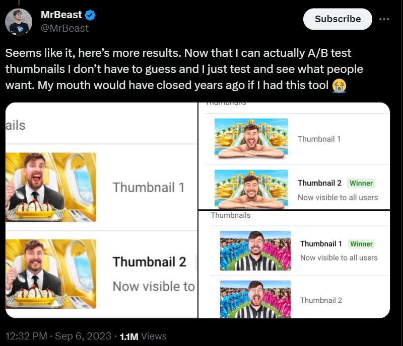
3. His real name is Jimmy so that's what I'll call him for the remainder of the post because while I respect his work and can't handle writing/referring to an adult human who isn't a wrestler as Mr. Beast again. Anyway, Jimmy shared, via Twitter (it is still Twitter) that he had done some A/B testing on his clips. A story in two Tweets. 

https://twitter.com/MrBeast/status/1699460698726613343

https://x.com/MrBeast/status/1699460698726613343?s=20

This story made the rounds because Mr. Beast is such a famous YouTuber. How can you use this example in class?

1. Introduce A/B testing, and how some of the techniques used by professional statisticians are actually pretty straightforward application of basic statistics tests (here, paired t-test).

2. Conduct a paired t-test: I made up some pretend data that imitates these findings.

3. Review the parts of a paired t-tests. IV: Smile vs. no smile. DV: Seconds spent viewing the video.

4. YouTube content creators may seem to prioritize content, lolz, etc., but a lot of the executive decisions about what videos to post have to do with what people are watching and how they watch the videos. That is all data. Yes, there are already data analytic firms just for influencer data. It is a job.

5. Depending on the kind of psychologist you are and what you teach, you could get into Duchenne smiles versus non-Duchenne smiles, the uncanny valley, etc. 


Comments

Popular posts from this blog

Ways to use funny meme scales in your stats classes

Have you ever heard of the theory that there are multiple people worldwide thinking about the same novel thing at the same time? It is the multiple discovery hypothesis of invention . Like, multiple great minds around the world were working on calculus at the same time. Well, I think a bunch of super-duper psychology professors were all thinking about scale memes and pedagogy at the same time. Clearly, this is just as impressive as calculus. Who were some of these great minds? 1) Dr.  Molly Metz maintains a curated list of hilarious "How you doing?" scales.  2) Dr. Esther Lindenström posted about using these scales as student check-ins. 3) I was working on a blog post about using such scales to teach the basics of variables.  So, I decided to create a post about three ways to use these scales in your stats classes:  1) Teaching the basics of variables. 2) Nominal vs. ordinal scales.  3) Daily check-in with your students.  1. Teach your students the basics...

Leo DiCaprio Romantic Age Gap Data: UPDATE

Does anyone else teach correlation and regression together at the end of the semester? Here is a treat for you: Updated data on Leonardo DiCaprio, his age, and his romantic partner's age when they started dating. A few years ago, there was a dust-up when a clever Redditor r/TrustLittleBrother realized that DiCaprio had never dated anyone over 25. I blogged about this when it happened. But the old data was from 2022. Inspired by this sleuthing,  I created a wee data set, including up-to-date information on his current relationship with Vittoria Ceretti, so your students can suss out the patterns that exist in this data.

If your students get the joke, they get statistics.

Gleaned from multiple sources (FB, Pinterest, Twitter, none of these belong to me, etc.). Remember, if your students can explain why a stats funny is funny, they are demonstrating statistical knowledge. I like to ask students to explain the humor in such examples for extra credit points (see below for an example from my FA14 final exam). Using xkcd.com for bonus points/assessing if students understand that correlation =/= causation What are the numerical thresholds for probability?  How does this refer to alpha? What type of error is being described, Type I or Type II? What measure of central tendency is being described? Dilbert: http://search.dilbert.com/comic/Kill%20Anyone Sampling, CLT http://foulmouthedbaker.com/2013/10/03/graphs-belong-on-cakes/ Because control vs. sample, standard deviations, normal curves. Also,"skewed" pun. If you go to the original website , the story behind this cakes has to do w...