
Whataburger Index: Operationalizing power outages in hurricane ravaged Texas.

As a stats nerd, I love it when clever people make lives easier by finding clever, easy, indirect ways to estimate the thing they want to measure. As a statistics instructor, I find such examples engaging, as they encourage students to think critically and nurture their statistical literacy. 

Like the Waffle Shop index. TL;DR: During weather emergencies, the federal government tracks whether or not Waffle Shops are open as a proxy for the severity of damage in a community. Waffle Shops are tough as hell, and if they close, a community needs help. 

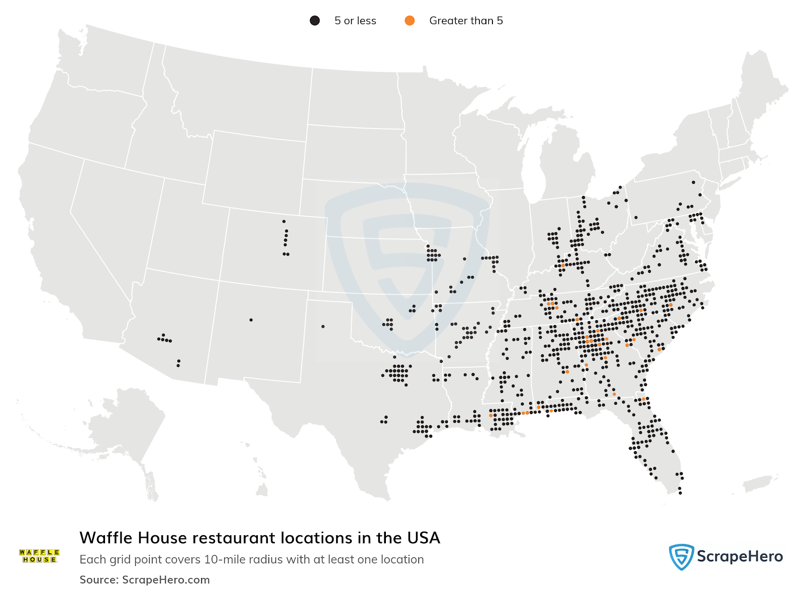
Below is a map of Waffle Houses.

https://www.scrapehero.com/store/wp-content/uploads/maps/Waffle_House_USA.png

Due to Hurricane Beryl, the people of Houston, Texas discovered an even more accurate measure the severity of electricity outages: The Whattaburger Index: 

 https://www.facebook.com/photo/?fbid=8242206945824619&set=gm.2698315720337038&idorvanity=1416658058502817


Certainly, Waffle House exists in Texas. 126, according to ScrapeHero. But there are more Whattaburgers. 733, also according the ScrapeHero. Which is why it has been such a good tool for tracking power outages in Texas due to Hurricane Beryl:


For more coverage to share in class, see this story by the Houston Chronicle

How to use it in class:

1. Large samples be good. The Whataburger Index is a more fine-grained sampling available in Texas this way, correct? The Waffle Shop Index offers some information, but the larger n-size crated by the Whataburger offers for a larger sample of Houston. 

2. How do you find data that you need quickly? By using clever archival data. Instagram data to find the happiest colleges in the United States. General Social Survey to test the validity of horoscopes. Whataburger data to track the electric grid in Houston. 

3. Warm-up activity for students. I think I might use this as a warm-up activity to ask students to find the Pennslyvania equivalent. Sheetz? Eat n' Park? As a follow-up, I might ask them to visit the corporate websites and see if there is a live map showing whether locations are open or closed.

4. Operationalization. You could operationalize damage by, say, insurance claims or phone surveys. Or, you could work very quickly by operationalizing damage using a free, readily available map of Whataburger locations. 

5. Data IRL. While I am delighted by the cleverness of this example, I realize that this map was used by desperate Houstonians dealing with awful weather and no electricity. In a time when there was a lot of confusion and not enough communication, this gave people the information they needed, in real-time and in real life. 


Comments

Popular posts from this blog

Ways to use funny meme scales in your stats classes

Have you ever heard of the theory that there are multiple people worldwide thinking about the same novel thing at the same time? It is the multiple discovery hypothesis of invention . Like, multiple great minds around the world were working on calculus at the same time. Well, I think a bunch of super-duper psychology professors were all thinking about scale memes and pedagogy at the same time. Clearly, this is just as impressive as calculus. Who were some of these great minds? 1) Dr.  Molly Metz maintains a curated list of hilarious "How you doing?" scales.  2) Dr. Esther Lindenström posted about using these scales as student check-ins. 3) I was working on a blog post about using such scales to teach the basics of variables.  So, I decided to create a post about three ways to use these scales in your stats classes:  1) Teaching the basics of variables. 2) Nominal vs. ordinal scales.  3) Daily check-in with your students.  1. Teach your students the basics...

Leo DiCaprio Romantic Age Gap Data: UPDATE

Does anyone else teach correlation and regression together at the end of the semester? Here is a treat for you: Updated data on Leonardo DiCaprio, his age, and his romantic partner's age when they started dating. A few years ago, there was a dust-up when a clever Redditor r/TrustLittleBrother realized that DiCaprio had never dated anyone over 25. I blogged about this when it happened. But the old data was from 2022. Inspired by this sleuthing,  I created a wee data set, including up-to-date information on his current relationship with Vittoria Ceretti, so your students can suss out the patterns that exist in this data.

If your students get the joke, they get statistics.

Gleaned from multiple sources (FB, Pinterest, Twitter, none of these belong to me, etc.). Remember, if your students can explain why a stats funny is funny, they are demonstrating statistical knowledge. I like to ask students to explain the humor in such examples for extra credit points (see below for an example from my FA14 final exam). Using xkcd.com for bonus points/assessing if students understand that correlation =/= causation What are the numerical thresholds for probability?  How does this refer to alpha? What type of error is being described, Type I or Type II? What measure of central tendency is being described? Dilbert: http://search.dilbert.com/comic/Kill%20Anyone Sampling, CLT http://foulmouthedbaker.com/2013/10/03/graphs-belong-on-cakes/ Because control vs. sample, standard deviations, normal curves. Also,"skewed" pun. If you go to the original website , the story behind this cakes has to do w...