I finally have an example of Spearman's rank correlation to share.
This is a political example, looking at how Twitter language usage differs in US counties based upon the proportion of votes that Trump received.
This example was created by Jack Grieves, a linguist who uses archival Twitter data to study how we speak. Previously, I blogged about his work that analyzed what kind of obscenities are used in different zip codes in the US. And he created maps of his findings, and the maps are color coded by the z-score for frequency of each word. So, z-score example.
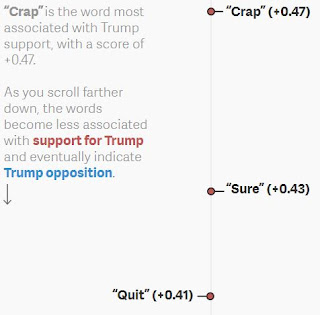
But on to the Spearman's example. More recently, he conducted a similar analysis, this time looking for trends in word usage based on the proportion of votes Trump received in each county in the US. NOTE: The screen shots below don't do justice to the interactive graph. You can cursor over any dot to view the word as well as the correlation coefficient. Grieve performed a Spearman's correlation. He ran the correlation by rank ordering 1) the 10,000 most commonly tweeted words and 2) the "level of Trump support in US counties" was measured as percentage of the vote for Trump (thanks for replying to my email, Jack!), with positive correlations indicating a positive relationship between Trump support and word usage. See below:
So, there is a lovely, interactive piece that lists words and the correlation coefficient for the relationship between that word and support for Trump. Grieves speculates that this data points to an urban/rural divide in Trump support.
Also of note, the data was collected two years before the election, so no "Bad Hombres", "Snowflakes, "She Persisted", "Winners", etc. showed up in this data, so it might be a snapshot of the differences that lead up to the current, rather divided electorate.
This is a political example, looking at how Twitter language usage differs in US counties based upon the proportion of votes that Trump received.
This example was created by Jack Grieves, a linguist who uses archival Twitter data to study how we speak. Previously, I blogged about his work that analyzed what kind of obscenities are used in different zip codes in the US. And he created maps of his findings, and the maps are color coded by the z-score for frequency of each word. So, z-score example.
 |
| Southerners really like to say "damn". On Twitter, at least. |
But on to the Spearman's example. More recently, he conducted a similar analysis, this time looking for trends in word usage based on the proportion of votes Trump received in each county in the US. NOTE: The screen shots below don't do justice to the interactive graph. You can cursor over any dot to view the word as well as the correlation coefficient. Grieve performed a Spearman's correlation. He ran the correlation by rank ordering 1) the 10,000 most commonly tweeted words and 2) the "level of Trump support in US counties" was measured as percentage of the vote for Trump (thanks for replying to my email, Jack!), with positive correlations indicating a positive relationship between Trump support and word usage. See below:
 |
| Trump supporting counties are going for the soft swears. |
 |
| And Clinton leaning counties don't give a f*ck, which may be because they've had one to many beers. |
So, there is a lovely, interactive piece that lists words and the correlation coefficient for the relationship between that word and support for Trump. Grieves speculates that this data points to an urban/rural divide in Trump support.
Also of note, the data was collected two years before the election, so no "Bad Hombres", "Snowflakes, "She Persisted", "Winners", etc. showed up in this data, so it might be a snapshot of the differences that lead up to the current, rather divided electorate.

Comments
Post a Comment