
CNN's The most effective ways to curb climate change might surprise you

CNN created an interactive quiz that will teach your students about a) making personal changes to support the environment, b) rank-order data, and c) nominal data.
https://www.cnn.com/interactive/2019/04/specials/climate-change-solutions-quiz/

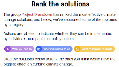
The website leads users through a quiz. For eight categories of environmental crisis solutions, you are asked to rank solutions by their effectiveness. Here are the instructions:
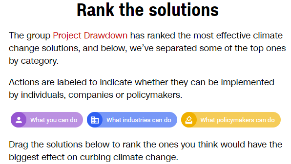

Notice the three nominal categories for each solution: What you can do, What industries can do, What policymakers can do.

Below, I've highlighted these data points for each of the "Our home and cities" solutions.


There are also many, many examples of ordinal data. For each intervention category, the user is presented with several solutions and they must reorder the solutions from most to least effective.

How the page looks when you are presented with solutions to rank order:

The website then "grades" your response:
After

The ordinal data is then presented as ratio data. While the data is still described by rank ordering, the data is also described in terms of environmental savings counted in the equivalent number of cars taken off the road. The ordinal difference might be the 1st and 2nd ranking, but the ratio scale difference is 31 million cars.

Popular posts from this blog

Ways to use funny meme scales in your stats classes

Have you ever heard of the theory that there are multiple people worldwide thinking about the same novel thing at the same time? It is the multiple discovery hypothesis of invention . Like, multiple great minds around the world were working on calculus at the same time. Well, I think a bunch of super-duper psychology professors were all thinking about scale memes and pedagogy at the same time. Clearly, this is just as impressive as calculus. Who were some of these great minds? 1) Dr.  Molly Metz maintains a curated list of hilarious "How you doing?" scales.  2) Dr. Esther Lindenström posted about using these scales as student check-ins. 3) I was working on a blog post about using such scales to teach the basics of variables.  So, I decided to create a post about three ways to use these scales in your stats classes:  1) Teaching the basics of variables. 2) Nominal vs. ordinal scales.  3) Daily check-in with your students.  1. Teach your students the basics...

Leo DiCaprio Romantic Age Gap Data: UPDATE

Does anyone else teach correlation and regression together at the end of the semester? Here is a treat for you: Updated data on Leonardo DiCaprio, his age, and his romantic partner's age when they started dating. A few years ago, there was a dust-up when a clever Redditor r/TrustLittleBrother realized that DiCaprio had never dated anyone over 25. I blogged about this when it happened. But the old data was from 2022. Inspired by this sleuthing,  I created a wee data set, including up-to-date information on his current relationship with Vittoria Ceretti, so your students can suss out the patterns that exist in this data.

Tyler Vigen's Spurious Correlations

Tyler Vigen has has created  a long list of easy-to-paste-into-a-powerpoint graphs that illustrate that correlation does not equal causation. For instance, while per capita consumption of cheese and number of people who die by become tangled in their bed sheets may have a strong relationship (r = 0.947091), no one is saying that cheese consumption leads to bed sheet-related death. Although, you could pose The Third Variable question to your students for some of these relationships). Property of Tyler Vigens, http://i.imgur.com/OfQYQW8.png Vigen has also provided a menu of frequently used variables (deaths by tripping, sunlight by state) to help you look for specific examples. This portion is interactive, as you and your students can generate your own graphs. Below, I generated a graph of marriage rates in Pennsylvania and consumption of high fructose corn syrup. Generated at http://www.tylervigen.com/