
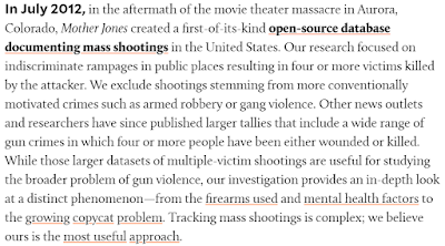
Mother Jones' magazine maintains a database of mass shooting events in the United States. 25 variables are collected from every shooting

MJs collects 25 variables from every shooting. Below, I've included their own description of the purpose of their database:
How to use in class:
Within this data is an example for every test we teach in Introduction to Statistics.
Correlation/Regression
Fatalities
Injuries
Age of shooter
Year of shooting
Chi-square
Shooter gender
Shooter ethnicity
Mass or Spree shooting
Were the weapons obtained legally?
ANOVA
Shooter ethnicity
T-test
Mass or Spree shooting
Were the weapons obtained legally?
Data Cleaning
Some of these columns need some work before analysis. For instance, there are multiple weapons listed under "Weapon Type". Which is reasonable, but not helpful for descriptive data. You could walk your students through the process of recoding that column into multiple columns. You could also explain that City and State could be in separate columns.
Graphs versus Raw Data: How should you present your data?
Mother Jones created an interactive map that includes some of the data from the spreadsheet. You could use this to discuss data presentation for different audiences or purposes. When might the map be more effective? When may you be in a situation where people would want to dig through the data?

Inclusion Criteria for Data: The website with the map also explains the inclusion criteria for their database, which allows you to discuss inclusion criteria in research. What factors may make a person ineligible for a research study? Imagine a study that investigates a specific type of person...who might be of interest to a personality psychologist? Or a neurologist?


MJs collects 25 variables from every shooting. Below, I've included their own description of the purpose of their database:

How to use in class:
Within this data is an example for every test we teach in Introduction to Statistics.
Correlation/Regression
Fatalities
Injuries
Age of shooter
Year of shooting
Chi-square
Shooter gender
Shooter ethnicity
Mass or Spree shooting
Were the weapons obtained legally?
ANOVA
Shooter ethnicity
T-test
Mass or Spree shooting
Were the weapons obtained legally?
Data Cleaning
Some of these columns need some work before analysis. For instance, there are multiple weapons listed under "Weapon Type". Which is reasonable, but not helpful for descriptive data. You could walk your students through the process of recoding that column into multiple columns. You could also explain that City and State could be in separate columns.
Graphs versus Raw Data: How should you present your data?
Mother Jones created an interactive map that includes some of the data from the spreadsheet. You could use this to discuss data presentation for different audiences or purposes. When might the map be more effective? When may you be in a situation where people would want to dig through the data?

Inclusion Criteria for Data: The website with the map also explains the inclusion criteria for their database, which allows you to discuss inclusion criteria in research. What factors may make a person ineligible for a research study? Imagine a study that investigates a specific type of person...who might be of interest to a personality psychologist? Or a neurologist?
