
The Washington Post's "The coronavirus pandemic and loss of aircraft data are taking a toll on weather forecasting"

The Washington Post, and numerous other media outlets, recent wrote about an unintended consequence of COVID-19 and the sudden drop off in commercial flights: Fewer data points for weather forecasts (PDF).

Due to the coronavirus, commercial flights are down:

Graph illustrating a steep decrease in flights since the pandemic began


How does this affect weather forecasts? Data is constantly being collected from commercial flights, and that data is used to predict future weather:


Screen shot of original story, detailing how flight information is used in forecasts


Ways to use in class:

A conceptual example of multivariate modeling: Windspeed...temperature...humidity...lots of different data points, from lots of different elevations, come into play when making our best guess at the weather. This is a non-math, abstract way to discuss such multivariate models.

A conceptual example of effect sizes/real-world effects: In the article, they clearly spell out the magnitude of the data loss. That is pretty easy to track since we can count the number of flights that have been canceled. More complex is determining the effect size of this data loss. 

Quote from article about real life effects.


Data in everyday life: Per my introduction, we use weather forecasts for many different reasons. 

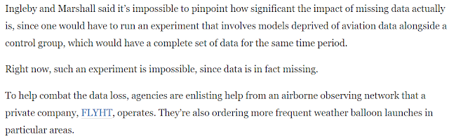
Control groups and alternate means of data collection: The article also contains excerpts of an interview data scientists who are trying to understand the magnitude of the issue AND solve it. Specifically, they stated that it is difficult to gauge the overall impact of the lack of data because they don't have a true control group (a nice example for RM) AND that they have come up with an alternative way of collecting high-altitude data: Good old weather balloons. This a good example of how a bit of expertise and creative thinking can be used to solve problems. 

Quotes from article about overcoming the shortcomings associated with decreased airplane data.


Comments

Popular posts from this blog

Ways to use funny meme scales in your stats classes

Have you ever heard of the theory that there are multiple people worldwide thinking about the same novel thing at the same time? It is the multiple discovery hypothesis of invention . Like, multiple great minds around the world were working on calculus at the same time. Well, I think a bunch of super-duper psychology professors were all thinking about scale memes and pedagogy at the same time. Clearly, this is just as impressive as calculus. Who were some of these great minds? 1) Dr.  Molly Metz maintains a curated list of hilarious "How you doing?" scales.  2) Dr. Esther Lindenström posted about using these scales as student check-ins. 3) I was working on a blog post about using such scales to teach the basics of variables.  So, I decided to create a post about three ways to use these scales in your stats classes:  1) Teaching the basics of variables. 2) Nominal vs. ordinal scales.  3) Daily check-in with your students.  1. Teach your students the basics...

Leo DiCaprio Romantic Age Gap Data: UPDATE

Does anyone else teach correlation and regression together at the end of the semester? Here is a treat for you: Updated data on Leonardo DiCaprio, his age, and his romantic partner's age when they started dating. A few years ago, there was a dust-up when a clever Redditor r/TrustLittleBrother realized that DiCaprio had never dated anyone over 25. I blogged about this when it happened. But the old data was from 2022. Inspired by this sleuthing,  I created a wee data set, including up-to-date information on his current relationship with Vittoria Ceretti, so your students can suss out the patterns that exist in this data.

If your students get the joke, they get statistics.

Gleaned from multiple sources (FB, Pinterest, Twitter, none of these belong to me, etc.). Remember, if your students can explain why a stats funny is funny, they are demonstrating statistical knowledge. I like to ask students to explain the humor in such examples for extra credit points (see below for an example from my FA14 final exam). Using xkcd.com for bonus points/assessing if students understand that correlation =/= causation What are the numerical thresholds for probability?  How does this refer to alpha? What type of error is being described, Type I or Type II? What measure of central tendency is being described? Dilbert: http://search.dilbert.com/comic/Kill%20Anyone Sampling, CLT http://foulmouthedbaker.com/2013/10/03/graphs-belong-on-cakes/ Because control vs. sample, standard deviations, normal curves. Also,"skewed" pun. If you go to the original website , the story behind this cakes has to do w...